Studio RococoMonogram Logo & Stationary Design

Sarah Reynolds Photography Model: Sammy Johnston
Studio Rococo tasked us with wanting to create a unique and memorable experience for the guests at their clinic. They are a modern, knowledgeable medical aesthetics and skincare clinic. They offer everything from skin treatments to hormone optimization programs.
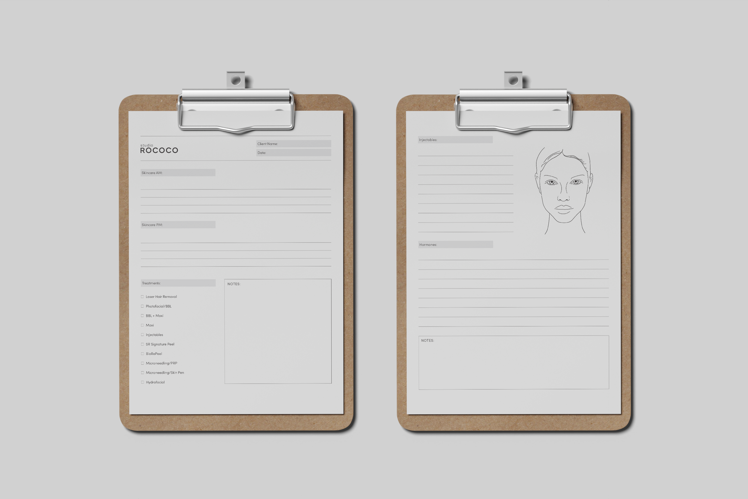
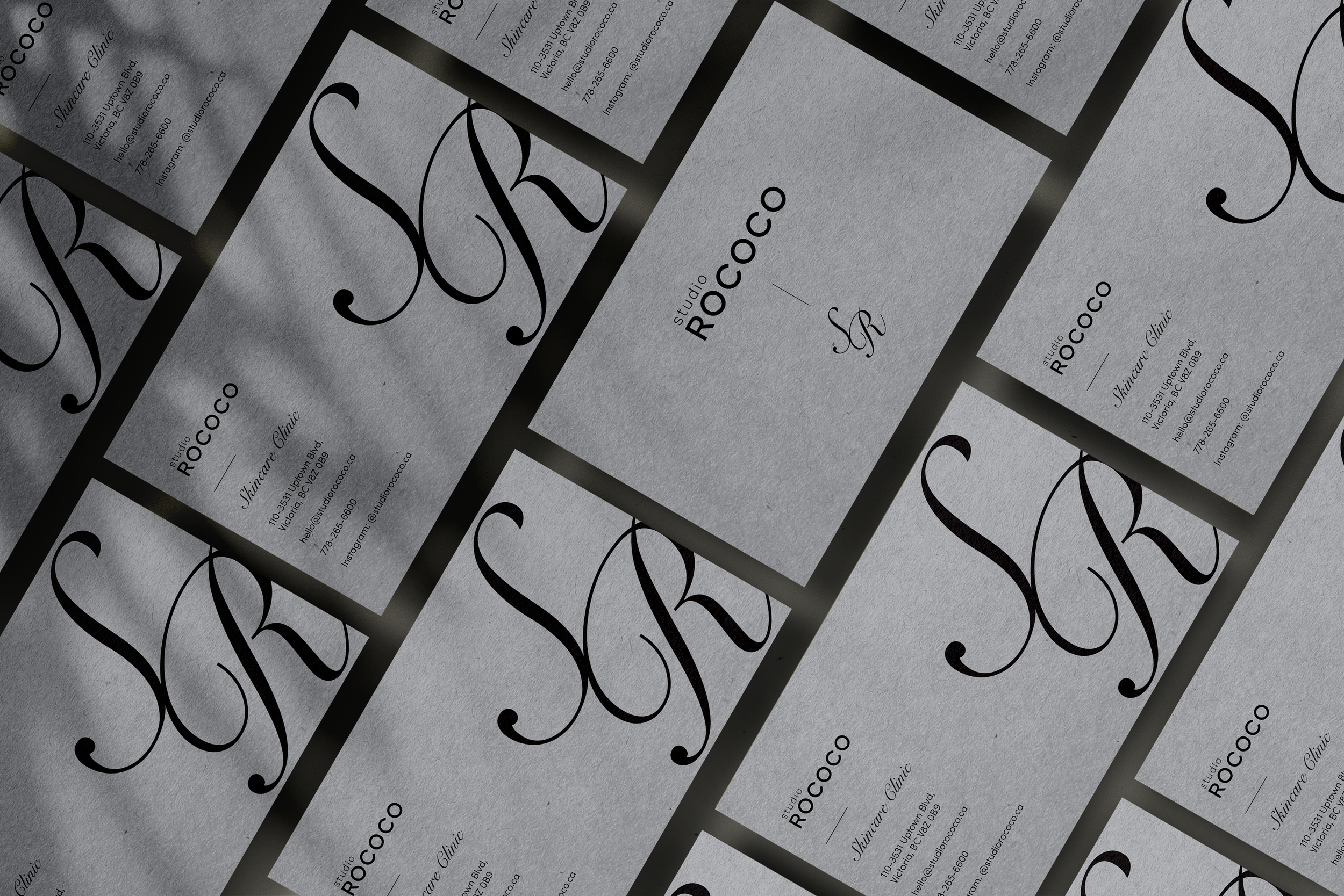
Kylee (founder) came to us with a clear goal to ensure the customers feel special and well taken care of. Challenging us to push the boundaries on client handouts such as: a list of service, business cards, hormone optimization information card, and client consultation cards.
Their demographic is primarily woman (some men) between the ages of 16-60. Due to their audience being a broad spectrum of people, it was important their clean, minimalistic brand identity remained the focus. To create designs that were new and innovative we focused on using layout and imagery to create a memorable experience.
Working closely alongside the founder of Studio Rococo, Kylee, I worked solo on this project. This entailed lots of back-and-forth communication, running things by all parties at the clinic including the doctor to ensure the products reflected the level of professionalism they provide as a company. This project was turned around in 10 weeks’ time total which was within the planned project timeline. The products remain a staple in their daily procedures with clients at the clinic.
Monogram Design by Mansueti Studios Sarah Reynolds Photography
Stationary Design & Other Work
Studio Rococo Identity
Studio Rococo was a client that already had a developed brand identity in terms of a logo and basic colour palette. We went in and fine tuned the overall brand package to be more user friendly for the client. Creating a distinct colour palette and typography system prior to developing any print design work.
Colour Palette
As a minimal, modern brand, we kept the colour palette simple and neutral to play into their calming, west coast feel.
Typography
To pair with their already established logo, we set a typography system for them to use on all related design work. The system consists of:
Sofia Pro: Used for all body copy and smaller titles.
Fino: Used for all large headings.
Stationary Design & Other Work
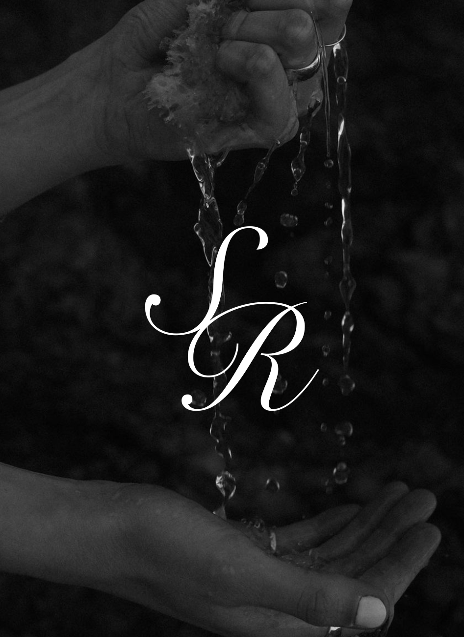
Lettermark Logo

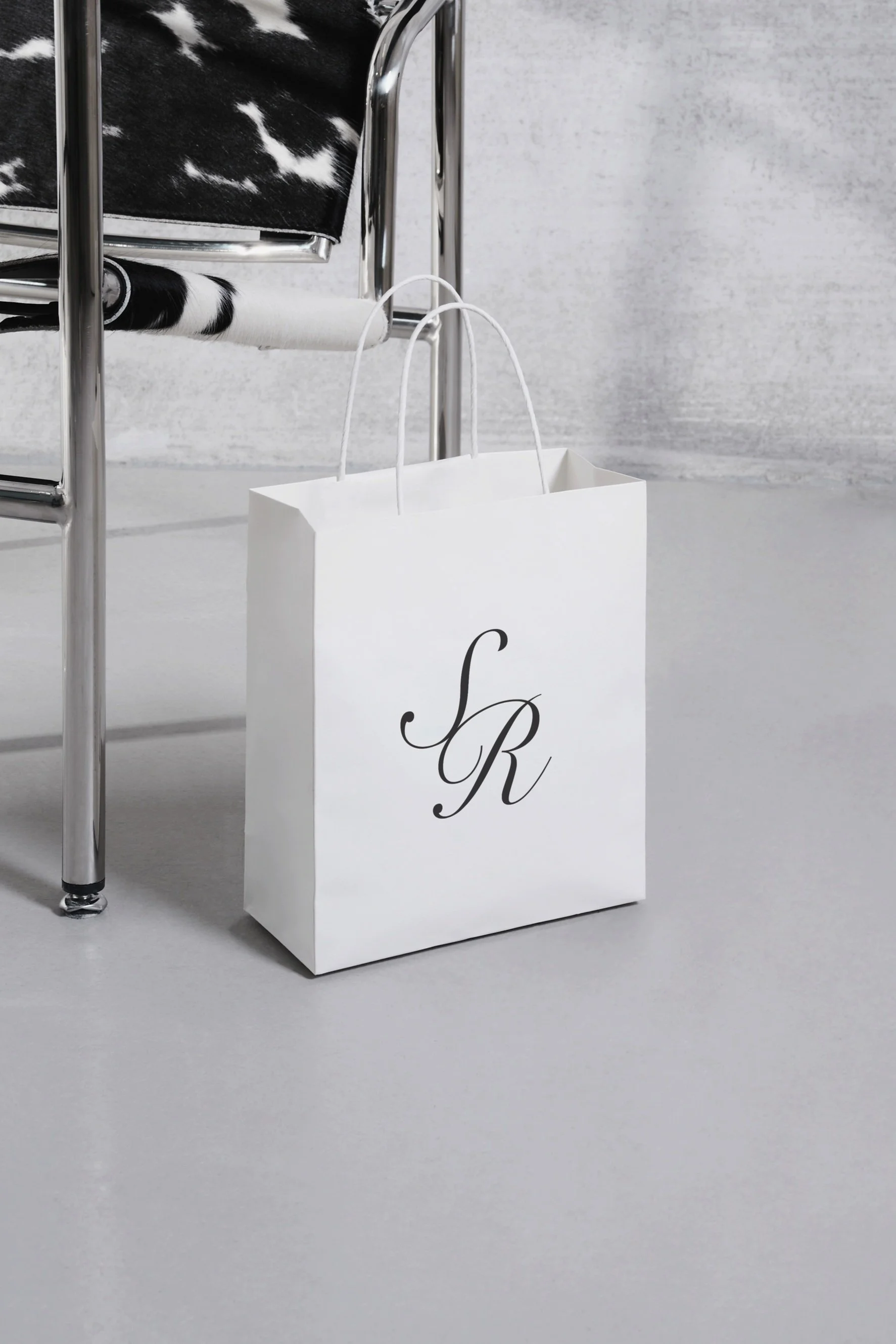
Behind the Logo
To embody the organic, sleek, and professional feeling, we landed on a script style monogram. This creates contrast from their traditional logo that is more modern and bold. It adds a delicate, timeless feel.
Stationary Design & Other Work
Business Cards

Stationary Design & Other Work
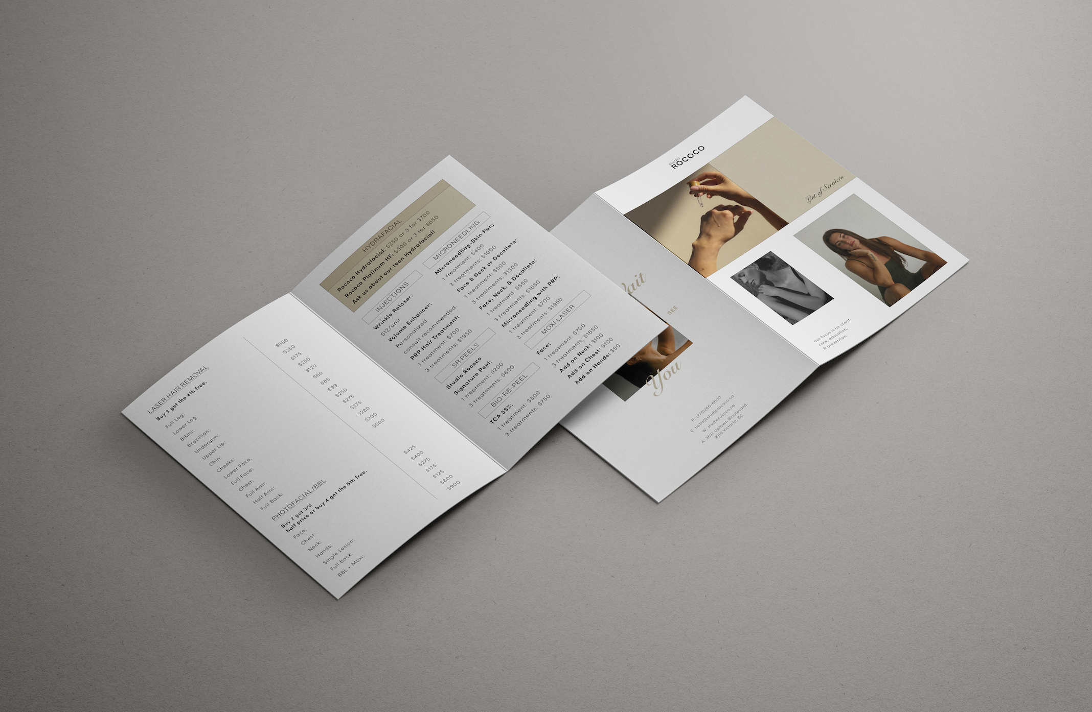
List of Service/Bi-fold Brochure

Stationary Design & Other Work
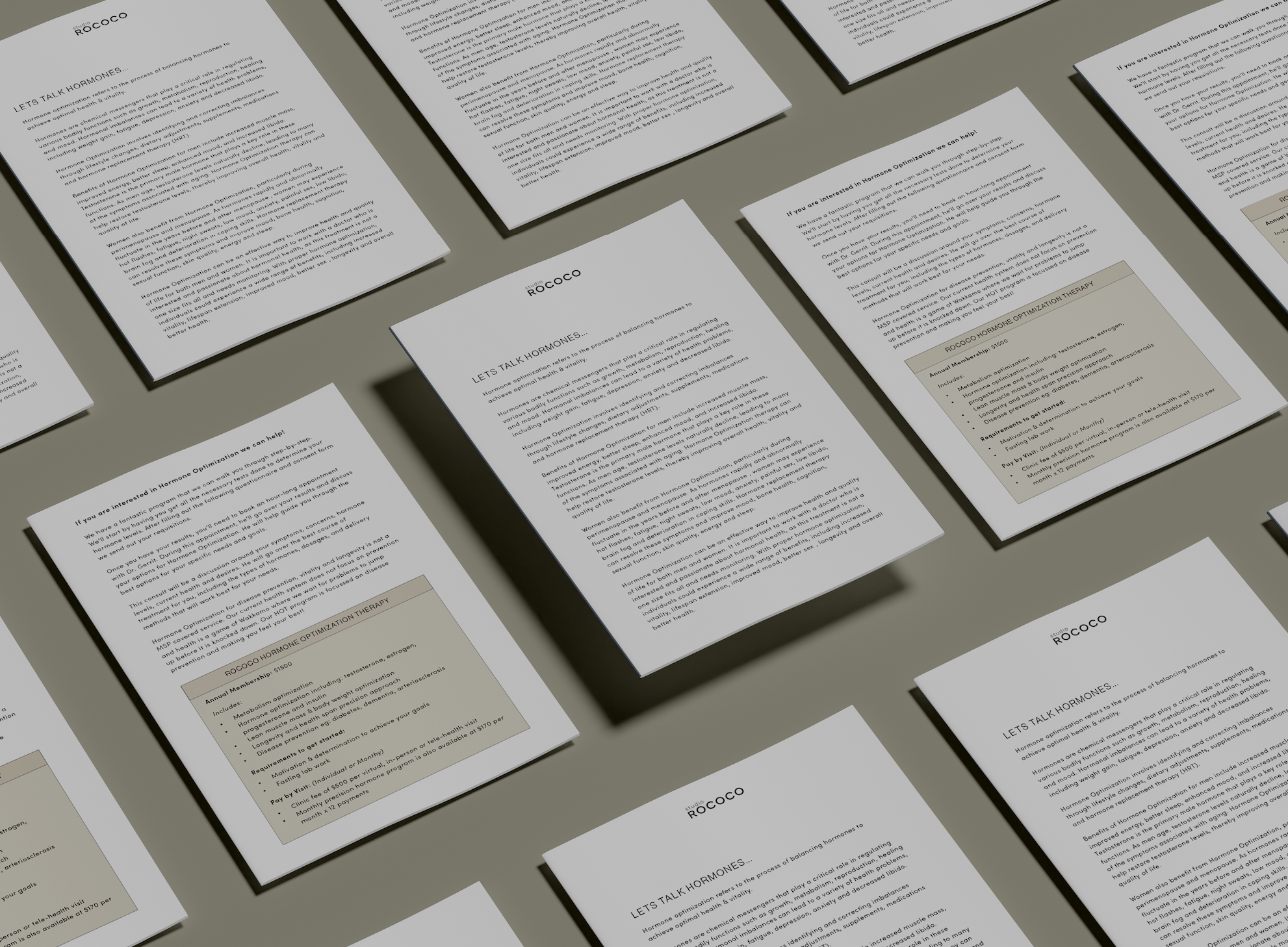
Hormone Optimization Pamphlet

Stationary Design & Other Work