Health & BalanceUX & UI Design
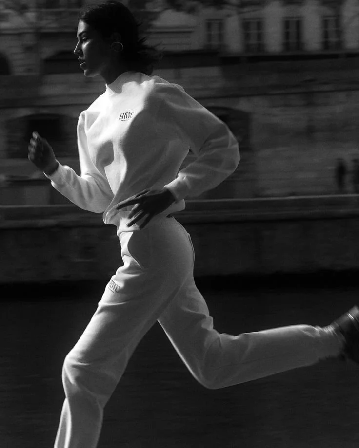
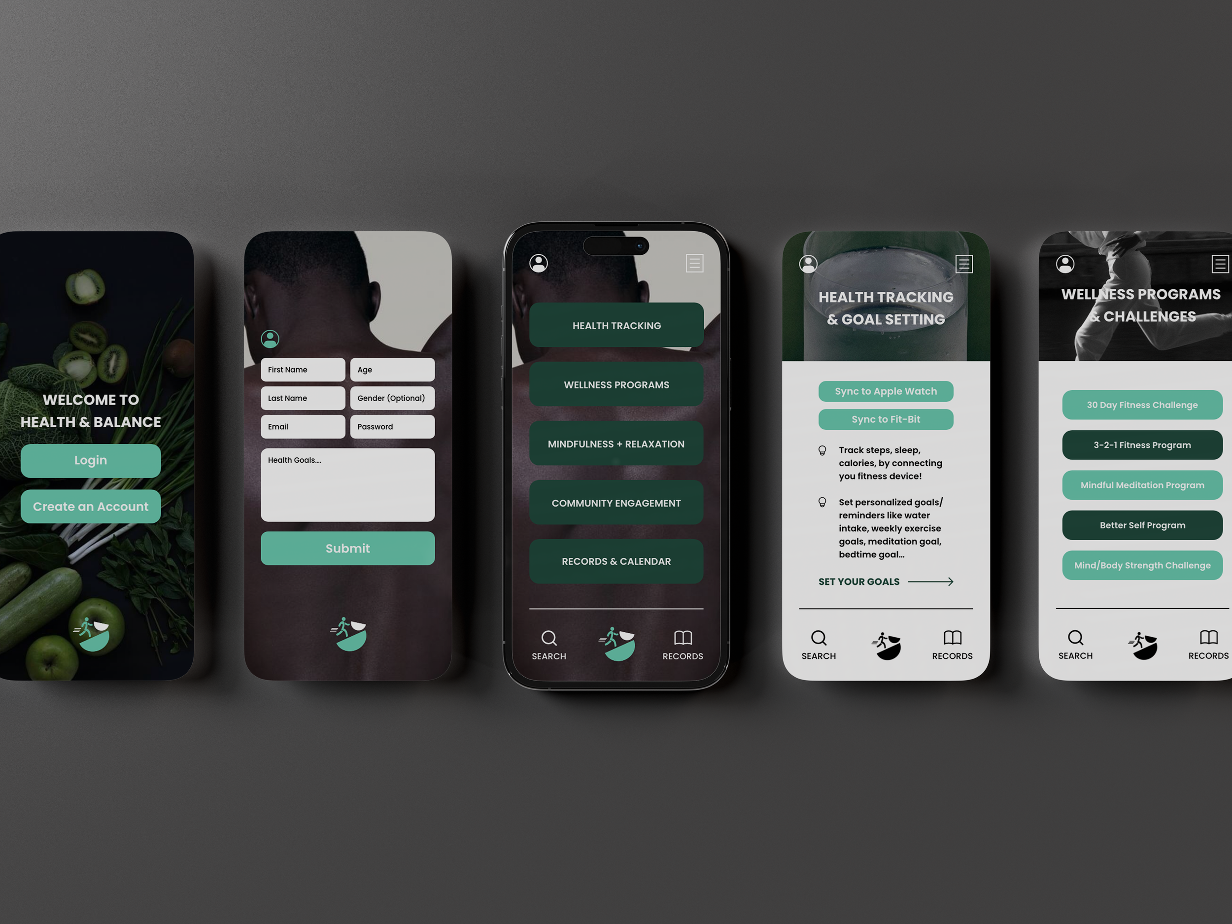
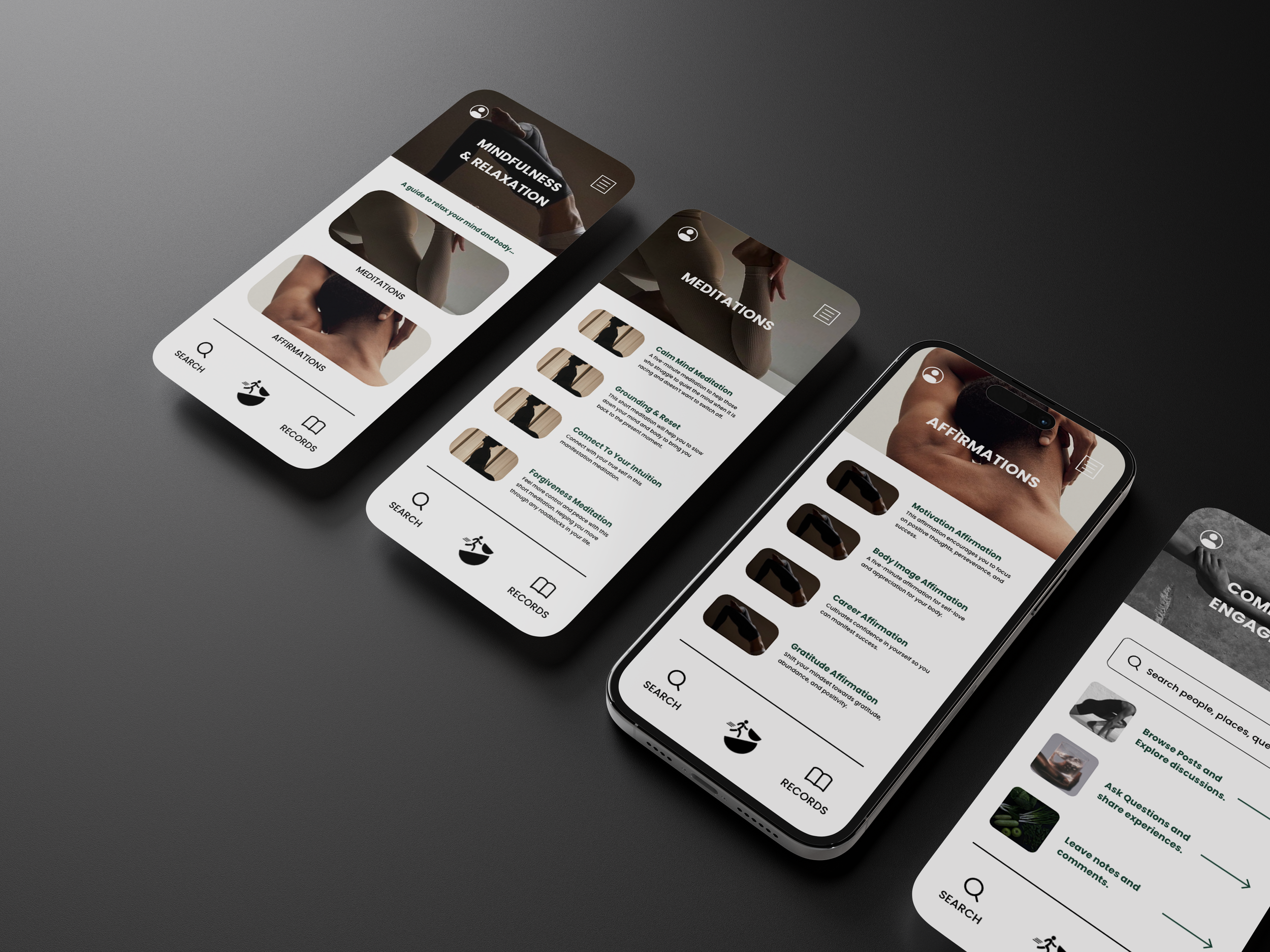
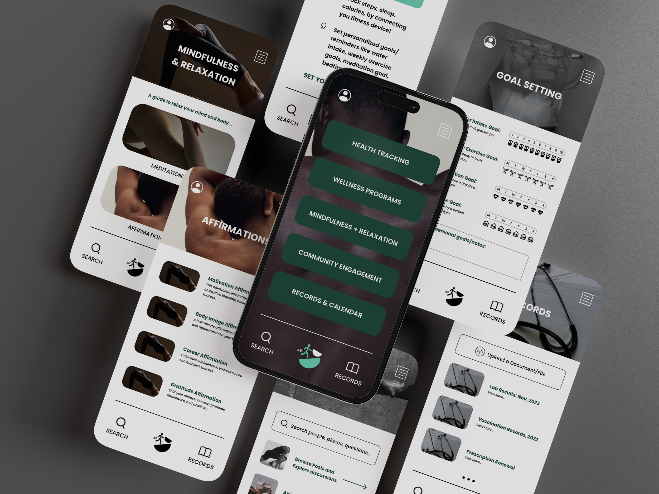
Health & Balance is a mobile application that aims to fulfill the need for a versatile health and lifestyle management solution. With Health & Balance users can seamlessly integrate health tracking, lifestyle management, fitness, wellness, mindfulness and relaxation into their daily routines.
This design was created from the ground up based on user research. The users of the application vary from individual persons, healthcare providers to developers and stakeholders. This is an application that can benefit a large audience of users. With user friendly navigation, visually appealing graphics and customizable features, Health & Balance is a solution to impact the lives of users worldwide.
We created not only a brand identity for Health & Balance (colour palette, typography etc..) but also designed the app icon, the layout of the app and all its basic functionalities.
2024
Fictional Project
UX & UI Design
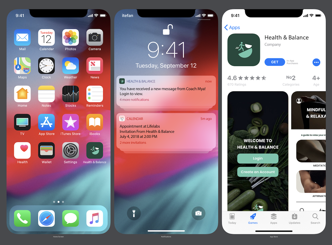
App Icon Design
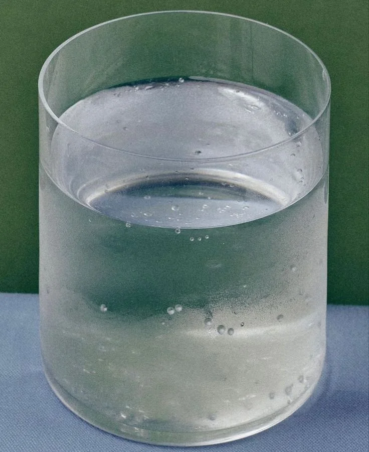
The overall aesthetic of H&B is clean, modern, bright, inspiring and stimulating. Ensuring that the users are left feeling lighter after their experience. The colour palette consists of crisp black and white for clear contrast against any background, a light, lively green, to emanate energy and hope, and a rich, deep green that represents new beginnings and growth. Green is a balanced colour. It has some of the calming attributes that blue has but it also pulls some of the energy you feel from yellow.
The icon design consists of two geometric shapes balancing on one another along with a graphic of a person in action also balancing with the shapes. It is a well-rounded design that represents the importance of finding balance in your life. The colour palette is applied to the graphic and the light green/white pop against the dark green background. In the future this design can be interchangeable and can be used for other brand designs in which the colour palette could be applied in various ways.
UX & UI Design